May 30, 2014

Agatha (Sequence and Process)

        My final project for 118B this semester was to produce an animated sequence as part of a group project.
Tagging along with Nicki Yee, Grace Lacuesta, and Kim Mucha, this is what we made in about a month:


Agatha (Short Sequence)
from Youri Dekker on Vimeo.

       I'm pretty proud of what we were able to accomplish, particularly because we were able to really take the idea that we had in our heads and successfully see it through to the final product. It was also cool to see how each of us had particular contributions to the sequence in addition to the animation that made it that much better in the end.

And here is the process behind it all....

CONCEPT:
We we're actually set on another piece of dialogue before landing on this one. I wanna give credit to Brie Henry though for finding such an awesome audio clip. The monologue  that she took it from was quite long, and so we trimmed and clipped it down, altered the pitch a little, and that made it more our own. We then spent an afternoon figuring out ideas and ways to explore who the character was.

These were my initial thumbnail sketches as I tried to figure out possible acting ideas and story beats. 

Kim drawing out Agatha's character design. 

Grace figuring out how to do the reference.  

Some image reference we used to get the feel for the setting. 

       Grace did an amazing job with all the video reference. You can see the majority of it in the Sequence Progression, which is also posted further below. I ended up going back and shooting some more reference based off of her initial takes, but a lot came out of that afternoon of work...


ANIMATIC:
Next came doing a rough 2D pass to try and enhance the poses and idea. It's always so cool to look back at this and see how far it's come from just a few drawings and an animatic. 


A pose I redrew after my initial 2D pass. 

AGATHA'S DESIGN:
While Grace and Nicki were off building the set in Maya and Kim was making all the bottles on the shelves, it was my job to finesse and alter the Female Malcolm Rig to make her more witch-like. It took a little bit of time with the texturing and altering her geometry little-by-little, but Kim's drawings really helped me figure out what to tweak and change in order to give a real personality.

Character designs from Kim Mucha.

The first attempt to see what she could look like in 3D.

And then pretty much the final look. 

       After this I decided to go in and try out a few facial expressions and hand poses so that everyone could use them as guides for when we animated them.

Some good ol' squash and stretch tests with the face.

DRAW OVERS:
After our first blocking pass, I thought I'd go over some of my poses in Photoshop to fix and tweak them. After doing that for my shot I found it so helpful that I figured I'd do the same for everyone else's shot as well as a way to help them out a bit too.


SMOKE TEST:
During all this madness of creating a 40-second animated sequence, we felt it would be cool to have smoke in the shot when Agatha poured in the potion. So Grace looked up a tutorial and used that as a guide to create a smoke simulation for inside the cauldron. We were going to have the smoke in all 4 shots, but that proved to be too much with the time we had, so we only did it for Kim's final shot.


LIGHTING:
I was also in charge of the lighting for the sequence. Kim had started to light her shot in a cool way with the light from the cauldron changing intensity and color when Agatha poured in the potion, so I used that as a guide for the rest of the shots. She had even created a cool glow coming out of the cauldron, which we were able to work into each shot as well. Some of the initial lighting passes I created had a really warm setting with the reds, but we ended up going with that route because it created a nice stark contrast with the green light at the end, making that laughter moment hit home all the more. 

Rough pass at the final set lighting. 

First attempt at lighting. 

Billionth attempt and final pass.

MUSIC & SOUND:
We really wanted to get an eerie feeling out of the whole sequence, and we found that sound could really help with that if we placed that subtly underneath the dialogue. Grace found both scary cemetery music and a relaxing rainfall piece, and we ended up going with the rainfall one because the calmness of that paired with her dialogue and the thunder was so much more unsettling. 


       I also had fun designing the opening title shot. I used layer masks in After Effects that I offset to slowly reveal the text, and then overlayed that with the sound effect of paper ripping and glass shards dropping on the ground to get a cool scratching noise.  

SEQUENCE PROGRESSION:
And here is everything together: reference, blocking, polish, and the final animation. 
Agatha (Sequence Progression)

And that's that. 


It was definitely a wild, crazy month of animating, but it was a lot of fun to create such a twisted character, especially with my good friends. Thanks for being Team Leaders ladies! 


May 27, 2014

May Sketches

Some more sketches....not in profile this time!


My Shrunkenheadman Presidency

       This past year I've had the honor of being a Shrunkenheadman President. As of last week that position ended for me, and it has been passed off to the amazing Rev Kotni. It's been such an incredible year, and the experience is something I'll never forget.

The Blank Team

       My team of officers we're so amazing and helpful, and they made every job and task so much easier and more doable. Over the summer we jokingly called ourselves "The Blank Team" simply because we weren't sure what to officially title our cabinet, and that the "blank" would soon be swapped out for something better once we solidified our ideas. But the name stuck and became a very appropriate title, because it meant that we had to be versatile and ready for anything. Cheesy, but true.
       Here's some more photos of things and events throughout the year...

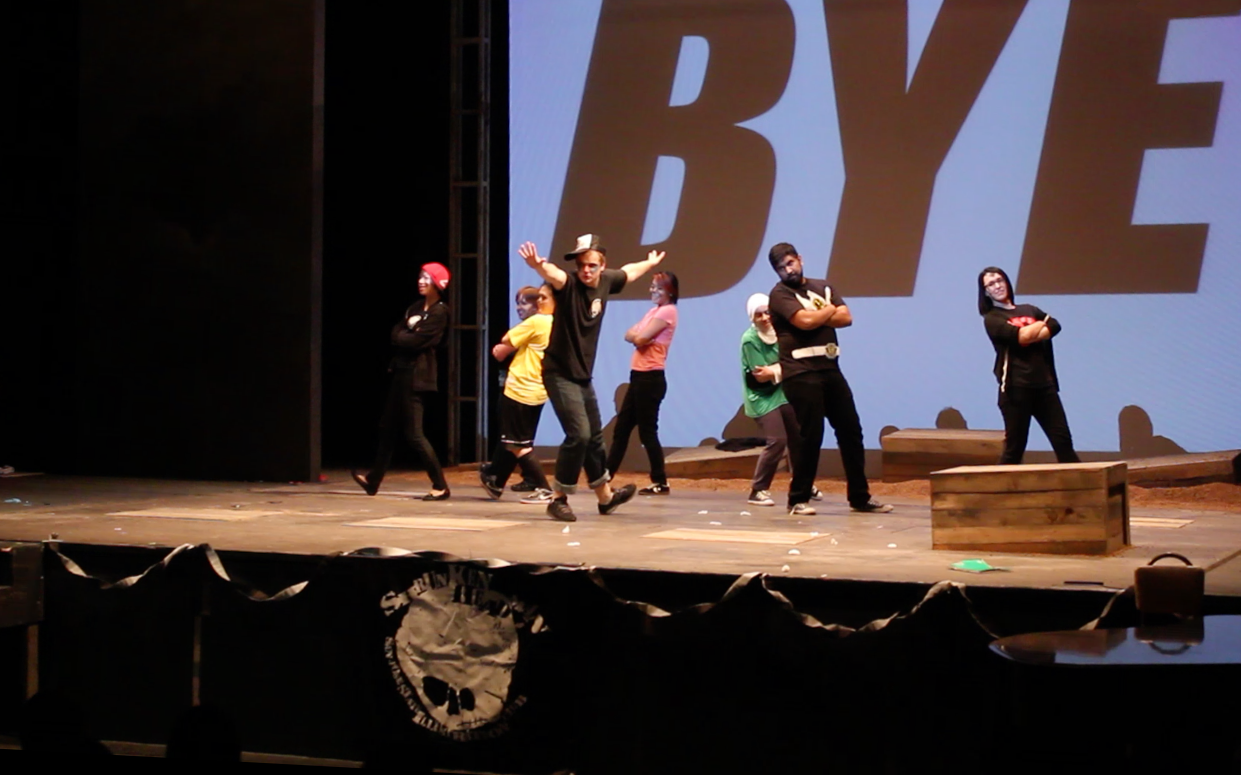
Me delivering a speech at the very first meeting back in September. 

The club during Bunny Carter's presentation in January. 

The Officers and I showing off our custom SHM jackets. 

Baking and enjoying pancakes with the best Vice President ever, Fiona Herse-Woo. 

Me with Kris Pearn, director of Cloudy With a Chance of Meatballs 2.

Our officer skit at D-Day. 

       The last SHM meeting was definitely an emotional night, filled with a lot of laughs and hugs. It was where we released the program's short films on DVD and dedicated them to Bunny Carter, Courtney Granner, and Jules Jammal. We had also thanked a bunch of people, including Dave Chai, Jared Mills, the SHM Charity Committee, and my good friend Ryan Eways for all of his work on the Shrunkisodes. The planning that went into that night was quite extensive, but the turnout and energy from the Club really summed up a great year, and to receive a standing ovation from everyone at the end was incredibly humbling and moving.

Poster design by Amit Kumar


And that was that. 

Me doing my speech during elections a little more than one year ago. 

Thank you to everyone who contributed to making this year what is was. It's no easy task being a Shrunkenheadman President, but everyone's energy and fire to making this organization what it is makes the job incredibly manageable and so much fun. Now onto BFA!

May 25, 2014

The Chess King (Dialogue Shot)

      The long semester is over, and it's high time I post some of the work I've been doing over the past few months. Here's the first of the many posts to come, which is an animation of my very first attempt at dialogue in 3D:


The Chess King (Dialogue Shot)

       The assignment was to choose a line with 3 words and create an animation off of it. When I found the "Shall we begin?" line, I saw this type of scene in my head, where a ruthless chess master was about to start his next match against a timid opponent. 
       I can remember being a kid and always playing chess against my dad. Never was he this intimidating, but there's always a competitive nature about him, so I thought I'd use that as a way to drive the shot. I dedicate this shot to him and all the time he's kicked my butt at sports over the years. 
   

       The first step was figuring out who the character was. I did some research on Magnus Calrsen, the reigning World Chess Champion, and in turn named my character after him.


       The next step was gathering reference. I took a lot from Star Trek: Into Darkness, the film which the line was from. Benedict Cumberbatch does a lot of great things with his eyes, so I pulled what I could from that. I also found a cool shot from Lawless that helped inspire some poses. There's no sound, sorry. 


I also began looking a lot at Anton Ego from Ratatouille. I love his performance and how he's animated, and so I did my best to study from that source material in addition to the live action reference. 


I then went in to build the chess set and create somewhat of an environment for the scene. 


Being that it was my first attempt at dialogue in 3D, I wanted to make sure to get the mouth shapes down before blocking and polishing in the computer, so I drew them out in 2D before hand. 


And then here's the shot progression. 
I shot my own reference, quickly roughed it out in 2D, then went on into Maya to finish it off. 

The Chess King (Shot Progression)

And that's that! It was really difficult keeping him alive considering how little he moved around. It was a quite a challenge trying to tell so much with so little, but I'm fairly pleased with the result.